9
Coca-Cola Posters
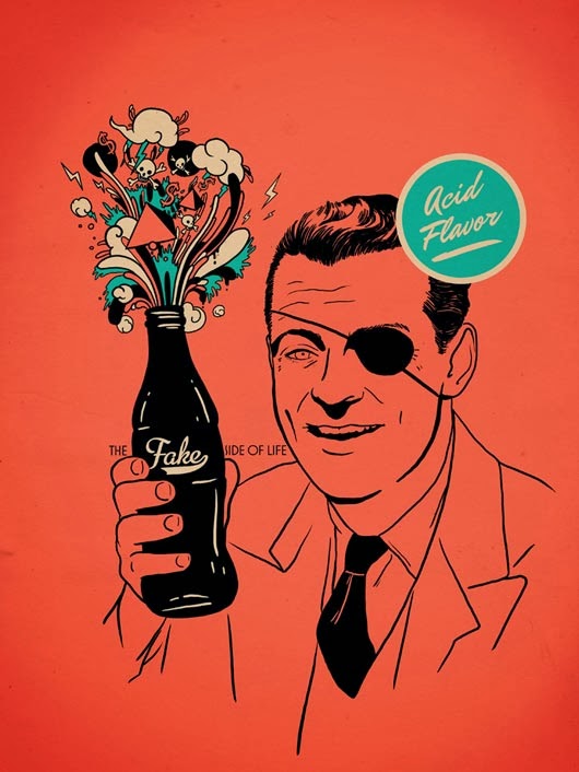
When I was exploring the internet for examples for my creativity journal, I stumbled on some Coca Cola ads, and then I found even more of them. I absolutely love this ad campaign and how unique they all are. They all have a different theme and I think they are all so unique and awesome.
When I was exploring the internet for examples for my creativity journal, I stumbled on some Coca Cola ads, and then I found even more of them. I absolutely love this ad campaign and how unique they all are. They all have a different theme and I think they are all so unique and awesome.


_________________________________________________________________
Chaos
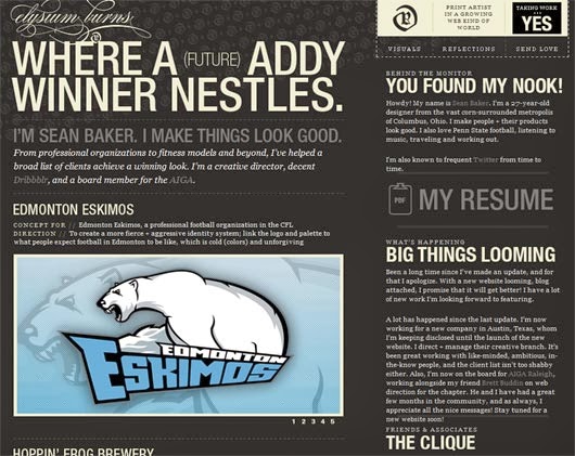
The past couple of weeks as I have been collecting examples for my creativity journal I have come across many terrible examples. To me, these bad examples present this feeling of chaos, and panic and clutter. To me, no piece should evoke this kind of emotion from viewers. However, I have found that in some rare cases, this chaos can be beautiful.

I have no words for this… I don't understand how some people can view this as a decent website.

This piece made me want to throw my computer against the wall.

So overwhelming, and so many bright colors.
The alignment and conflicting colors really rub me the wrong way.

Need I say more?

This logo has potential to be good, but the font colors and just weird angles make it really hard to look at. The color scheme is pretty great though.

I literally can't look at it for more than a couple seconds.

This layout is confusing to me, I can't decide if I love it, or hate it.

Im not sure if this is an advertisement or just an example of what not to do.
No comments:
Post a Comment