7
Color Psychology
Red:the color of energy, passion and action. It excites the emotions and motivates us to take action. It is the color of sexuality, and can stimulate deeper and more intimate passions in us like love and sex or anger and revenge.


Orange:the color of social communication and optimism. It can also mean pessimism and superficiality. It radiates warmth and happiness. Orange offers emotional strength in difficult times. The color orange rejuvenates our spirit.


Yellow:the color of the mind and the intellect. It is optimistic and cheerful. It can also suggest impatience, criticism, and cowardice. The color yellow offers hope, happiness, and fun. It can also be related to clarity of thought.


Green:the color of balance and growth. It can mean self-reliance as a positive, and possessiveness as a negative. The color green creates equilibrium between the mind and the heart. Green promotes a love of nature and love of family.


Blue:the color of trust and peace. It can suggest loyalty and integrity as well as conservatism and frigidity. This color promotes both physical and mental relaxation. Blue is also the color of religious study and spirit.


Indigo:the color of intuition. It can mean idealism and structure as well as ritualistic and addictive. Indigo represents devotion and wisdom, as well as justice. The negative side of indigo is that it can relate to addiction, and it can be narrow minded and prejudiced.

Purple:the color of imagination. It can be creative and individual or immature and practical. Purple and violet represent the future, imagination and dreams, while calming the emotions. Purple and violet promote harmony of the mind, contributing to mental balance and stability.


Turquoise:the color of communication and clarity of mind. It can also be impractical and idealistic. The color turquoise presents a friendly and happy color enjoying life. This color recharges our spirits and alleviates feelings of loneliness. It is also a good color to aid in concentration.


Pink:the color of unconditional love. Pink represents compassion, and nurturing. The deeper the pink, the more passion and energy it exhibits.Pink is characterized as thoughtful and caring, it is also a sign of hope. It can also be immature, silly, and girlish.


Brown:this down-to-earth color that relates to security, protection, and material wealth. It is a color of physical comfort, simplicity and quality. Brown is friendly and approachable, it is loyal and trustworthy as well as dependable. Brown is honest, genuine and sincere.


Gray:the color of compromise, it is the transition between two non-colors (black and white.)Gray is solid and stable, which creates a sense of calm and composure which offers relief from the chaotic world. Gray is quiet and reserved, it does not stimulate, energize, rejuvenate and excite.


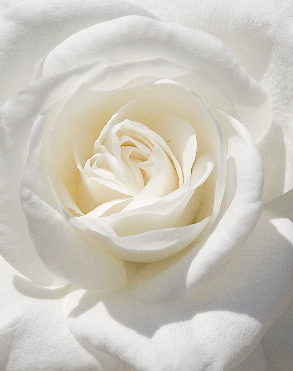
White:the color at its most complement and pure, the color of perfection. It means purity, innocence, wholeness and completion.White is the color of new beginnings, it represents a blank canvas waiting to be written upon. This color offers an inner cleansing and the refreshing and strengthening of your entire energy system.


Black: the color of the hidden, the secretive and unknown. It creates an air of mystery. It keeps things bottled up inside, hidden from the world. Black creates a barrier, and hides insecurities. Black means power and control, it is also intimidating, unfriendly, and unapproachable because of the power it exudes.


_________________________________________________________________
Black and White
I think that a lot of people consider black and white to be too simple, or not as visually pleasing as colors may be. I can understand why, because black and white doesn't quite present as much bold emotion as the others. However, I think that if used the right way, black and white designs may be more effective and visually pleasing.


 This is my favorite kind of design. I love all the details within the lines, and the high contrast. It shows how you don't need color to attract attention and add more detail. All of that is available with black and white.

I think that a lot of people consider black and white to be too simple, or not as visually pleasing as colors may be. I can understand why, because black and white doesn't quite present as much bold emotion as the others. However, I think that if used the right way, black and white designs may be more effective and visually pleasing.

I love the contrast and detail in this piece. I love the message it puts forth in a twisted kind of way. I also love how the spray paint can is spraying a piece sign in a distorted way. I think it utilizes the color scheme really well.

This piece portrays black and white perfectly. The high contrast and detail comes together to make a really great piece. I love this piece all around, and could stare at it for hours.


I like this one because it shows how you can make a nice and effective logo without a lot of color. I love how it guides your attention and maintains it well. I love the bold lines. and the text below it.
No comments:
Post a Comment