13
Logos
Just some creative examples of logos that I stumbled upon. Thought it would be helpful to have this to refer to if I ever have to design a logo.


Just some creative examples of logos that I stumbled upon. Thought it would be helpful to have this to refer to if I ever have to design a logo.

I really liked this one, I love how they incorporated the concept of the pencil and the rocket to bring it all together.

I included this google one, because I think that they always have really great designs that makes it fun to hop on google. I love how they incorporate special days and holidays in their designs.
I think this is a fun design for a baby company, its not so obvious but its cute and fun and colorful and makes you want to know more about it.
I love the concept behind this, and I love the color used for the wires. I also love the double meaning behind it, and I love how they bolded one of the words.

I really love red on cream, and I really like the lettering they chose. I really like the details within the ship as well.

I love the way they meshed the lettering and the fish. I also really like the color agains the off white background. I think they executed the concept really well.
I included this one because I love dogs, and I thought this was really cute.

This is my favorite NHL logo right next to the black hawks logo. I love the simplicity of it, and the concept. I think its an interesting team name and I think they incorporated it well.
This is my second favorite sports logo, I love the color and the details, and I think the way it is all put together works together really well.
I think this is a good example of them incorporating the country and the colors of the country.
__________________________________
Photography
Photography is one of my favorite styles of art and I think from it you can really draw a lot of inspiration from it.

I think this is a really powerful photo, and the lighting is flawless.

I love how this is divided by the crowd, and how ironic of an image it really is.

I absolutely love the color in this image, and I think this is a good image to pull a color scheme from.
I think light photography always has a good outcome and can always produce really good colors.

I love silhouette photography, and I love the bold contrast. I think contrast makes an image even more powerful than it already is.

I have no words for this image, the bright orange hues and shades immediately caught my eye. Such a powerful image.
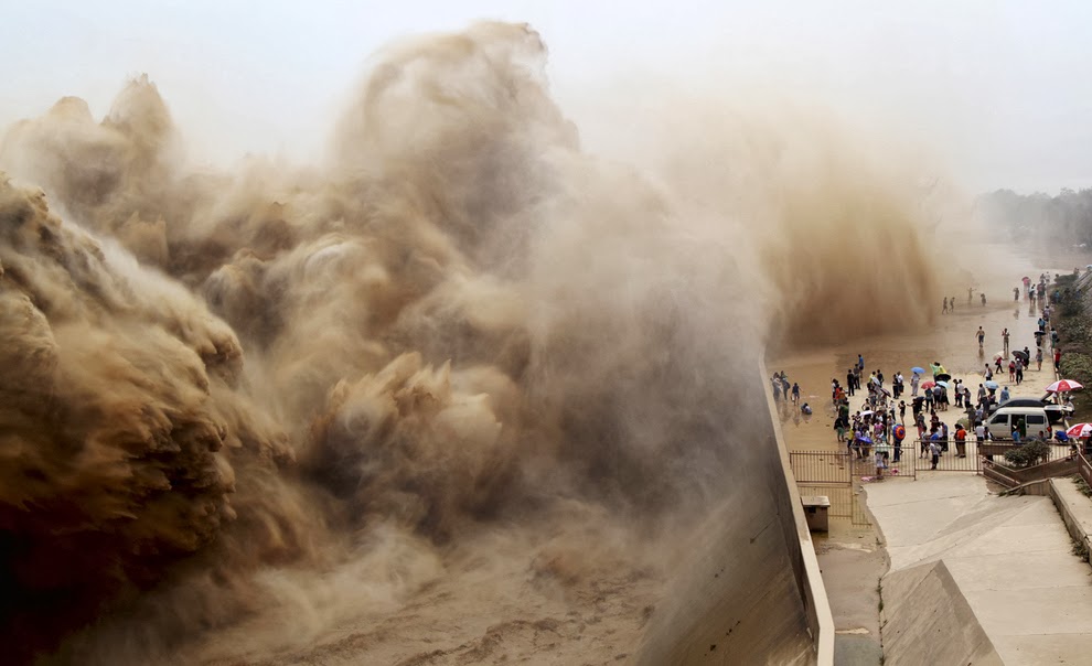
I love this photo because it seems so unreal, and you honestly can imagine something so powerful being so real. The clarity in the wave and texture is crazy.

I love the concept of this one, and I love the color in the sky. It reminds me of the gradient fill on Corel.

I love how only one zebra is looking at the camera, and I love the contrast in the stripes, and the depth of field of this photograph.

I think this is a fun photo, and I love how they edited it really cleanly and it seems so real.

I love this photo because it is raw, and just captures beautiful emotion.

This is one of my all time favorite photographs. I love it for multiple reasons, I love the color and the intensity of it. I love that Steve McCurry didn't edit it, and that it is a film photo.
No comments:
Post a Comment