Thursday, December 12, 2013

Week 15

15

Web Design


I like the messiness of it, and I like the personality it brings. 


I love the rainbow and the bright colors. Its very attention grabbing, which is important. 


I really love the layout and concept behind this web page. 


I love the design and the muted background. 


I think the reason I love this so much is because its relaxed and kind of funny which makes it really easy to look at. 


I love the interesting shapes they used for the gallery, it adds interesting dimension and I really love the bold white font. 


I love the clip art and the way they tied it all together. I also really loved the color scheme. 

__________________________________

T-Shirt Design


I love the detail and the way they did opposites with half lettering in the white and the other in the red. 


I still love Obamas campaign, and I think he really took campaigning to a new level. 


This shirt is brilliant, I love the bright colors against the plain background. 

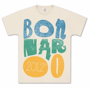
This is an excellent music festival t-shirt. The colors are great and the abstract lettering fits the event extremely well. 


The graphics on this shirt are great, and the colors used work well together. 


I love this shirt. I love the realistic heart and the saying with it. The font choice is perfect and all the colors work well together. 


This is one of my favorite music festival designs, and it just goes to show how a good design and good logo can be used in so many different ways. 

Week 14

14
Advertising

There is so much creative advertising in the world, and I think its important to look at as much of it as you can to not only draw inspiration, but to also make sure you don't produce anything too similar to anything that has already been done. 


I love the texture in the fill of the background and the contrast in the white font. I also really like the concept behind it, and I think they did a good job. 


I think this is one of my favorite advertisements i've seen and I love how they executed it. Its a really good idea and its really well done. 


I love this, I love the color, and the idea behind it. I love the heart with the drop of water in it. I don't like the photography placement though. 


I think this is a creative advertisement and I think it advertises the zoo really well. 


I found this ad ironic. Veggies from McDonalds? 


This is a really good ad for FedEx, and I love how they incorporated the company colors and how they executed the idea. 


This is a good idea, I like how it looks almost realistic at first glance. 


This is a really funny advertisement and it sells its focus really well. I also like how the worms almost look appetizing. 


Everyone loves Queen B. 


I thought this was a funny advertisement, and I love how they took down the saturation in the background. 
_________________________________

Flyers

I believe that flyers are some of the most important ways to advertise a company or event. I think if they are well done, they can really draw a lot of attention and really sell an event. Its important to include all the necessary details in a flyer so you don't confuse anyone. 


I love the white text on the background. I love the image in the middle, and the lines they used to supplement the text. 


I love the bright colors, and the art work above everything. I think its informative and attention grabbing, which is exactly what a flyer needs. 


I really love this flyer, I love the font, and the unusual color choice. 


I like the idea behind this because I think it just it brings a new energy to religion and could potentially draw in people who might not be interested before seeing the flyer. 


I absolutely love this flyer. The bright yellow, and the font choice. I think its informative and visually pleasing and I would definitely attend the event. 


I love the layout of this flyer, and I love the bold lettering and the shapes behind the subject. It immediately grabs attention and gives you all the information you need. 


This flyer caught my attention because it fits the personality of the DJ's really well. I love the muted color scheme, and the shapes in the middle. 

Week 13

13

Logos

Just some creative examples of logos that I stumbled upon. Thought it would be helpful to have this to refer to if I ever have to design a logo. 
I really liked this one, I love how they incorporated the concept of the pencil and the rocket to bring it all together. 


I included this google one, because I think that they always have really great designs that makes it fun to hop on google. I love how they incorporate special days and holidays in their designs. 

I think this is a fun design for a baby company, its not so obvious but its cute and fun and colorful and makes you want to know more about it. 


I love the concept behind this, and I love the color used for the wires. I also love the double meaning behind it, and I love how they bolded one of the words. 


I really love red on cream, and I really like the lettering they chose. I really like the details within the ship as well. 


I love the way they meshed the lettering and the fish. I also really like the color agains the off white background. I think they executed the concept really well. 


I included this one because I love dogs, and I thought this was really cute. 


This is my favorite NHL logo right next to the black hawks logo. I love the simplicity of it, and the concept. I think its an interesting team name and I think they incorporated it well. 


This is my second favorite sports logo, I love the color and the details, and I think the way it is all put together works together really well. 


I think this is a good example of them incorporating the country and the colors of the country. 

__________________________________


Photography

Photography is one of my favorite styles of art and I think from it you can really draw a lot of inspiration from it.


I think this is a really powerful photo, and the lighting is flawless. 


I love how this is divided by the crowd, and how ironic of an image it really is. 


I absolutely love the color in this image, and I think this is a good image to pull a color scheme from. 


I think light photography always has a good outcome and can always produce really good colors. 


I love silhouette photography, and I love the bold contrast. I think contrast makes an image even more powerful than it already is. 


I have no words for this image, the bright orange hues and shades immediately caught my eye. Such a powerful image. 


I love this photo because it seems so unreal, and you honestly can imagine something so powerful being so real. The clarity in the wave and texture is crazy. 


I love the concept of this one, and I love the color in the sky. It reminds me of the gradient fill on Corel. 


I love how only one zebra is looking at the camera, and I love the contrast in the stripes, and the depth of field of this photograph. 


I think this is a fun photo, and I love how they edited it really cleanly and it seems so real. 


I love this photo because it is raw, and just captures beautiful emotion. 


This is one of my all time favorite photographs. I love it for multiple reasons, I love the color and the intensity of it. I love that Steve McCurry didn't edit it, and that it is a film photo.