8
Rule of Thirds
In the rule of thirds, photos are divided into thirds with two imaginary lines vertically and two lines horizontally making three columns, three rows, and nine sections in the images. Important compositional elements and leading lines are placed on or near the imaginary lines and where the lines intersect.


.png)
_________________________________________________________________________________
Posters
These are just a few of my favorite creative posters that I stumbled upon this week. As they always say, old school knows best.


These are just a few of my favorite creative posters that I stumbled upon this week. As they always say, old school knows best.
I love the contrast, and the message behind this photograph. Its a really powerful image.

I love the artistic beauty of this poster, and I really like the color and detail.

Its kind of a goofy image, but I love the color and the bold font.

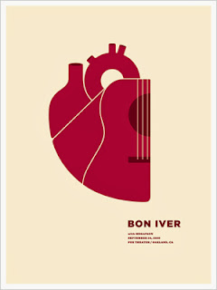
I really love the layout of this one. I love the red on the nude background and the bold type accompanied by the smaller type.

This is one of my favorites. I love the black piano on the golden olive backdrop. I love the detail in the keys and the variety in font color.

I really like the use of color splash in this one with the red. I also really enjoy the destroyed background to give it a little bit more dimension and texture. It really adds a lot to the image and final product.

I love how they combined the guitar and the bottle, the only thing I don't like is the strange font, I don't think it mixes well with the rest of the poster. I love the colors though.


I think this is a really well done advertisement and I love the color triad palette they used. I love the detail and the silhouettes used. I also thought they utilized the variety of text extremely well and they fonts work well together.

This is one of my favorite music festival posters. I love how it says "of peace and and music" and I really like the color scheme used. I really enjoy abstract pieces and this is definitely really well done.
No comments:
Post a Comment