14
Advertising
There is so much creative advertising in the world, and I think its important to look at as much of it as you can to not only draw inspiration, but to also make sure you don't produce anything too similar to anything that has already been done.
There is so much creative advertising in the world, and I think its important to look at as much of it as you can to not only draw inspiration, but to also make sure you don't produce anything too similar to anything that has already been done.

I love the texture in the fill of the background and the contrast in the white font. I also really like the concept behind it, and I think they did a good job.

I think this is one of my favorite advertisements i've seen and I love how they executed it. Its a really good idea and its really well done.

I love this, I love the color, and the idea behind it. I love the heart with the drop of water in it. I don't like the photography placement though.
.jpg)
I think this is a creative advertisement and I think it advertises the zoo really well.

I found this ad ironic. Veggies from McDonalds?

This is a really good ad for FedEx, and I love how they incorporated the company colors and how they executed the idea.

This is a good idea, I like how it looks almost realistic at first glance.

This is a really funny advertisement and it sells its focus really well. I also like how the worms almost look appetizing.
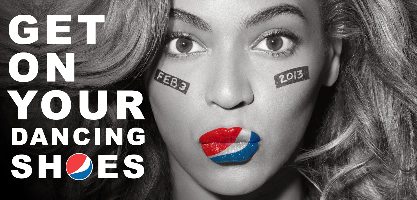
Everyone loves Queen B.

I thought this was a funny advertisement, and I love how they took down the saturation in the background.
_________________________________
Flyers
I believe that flyers are some of the most important ways to advertise a company or event. I think if they are well done, they can really draw a lot of attention and really sell an event. Its important to include all the necessary details in a flyer so you don't confuse anyone.


.jpg)

I believe that flyers are some of the most important ways to advertise a company or event. I think if they are well done, they can really draw a lot of attention and really sell an event. Its important to include all the necessary details in a flyer so you don't confuse anyone.

I love the white text on the background. I love the image in the middle, and the lines they used to supplement the text.

I love the bright colors, and the art work above everything. I think its informative and attention grabbing, which is exactly what a flyer needs.

I really love this flyer, I love the font, and the unusual color choice.

I like the idea behind this because I think it just it brings a new energy to religion and could potentially draw in people who might not be interested before seeing the flyer.

I absolutely love this flyer. The bright yellow, and the font choice. I think its informative and visually pleasing and I would definitely attend the event.
.jpg)
I love the layout of this flyer, and I love the bold lettering and the shapes behind the subject. It immediately grabs attention and gives you all the information you need.

This flyer caught my attention because it fits the personality of the DJ's really well. I love the muted color scheme, and the shapes in the middle.
No comments:
Post a Comment