12
Branding
As we looked into the branding assignments, I decided to follow one of the most influential and well branded companies to date. Nike has had powerful advertising and designs for so many years, and it was easy to see how well branded it was and how that branding has attributed to their success.
As we looked into the branding assignments, I decided to follow one of the most influential and well branded companies to date. Nike has had powerful advertising and designs for so many years, and it was easy to see how well branded it was and how that branding has attributed to their success.

I love how this is more of an abstract style with the font, and how the colors add dimension and really make it that much more interesting to look at.

This style of nike ad isn't my personal favorite but I think its so creative and the design would appeal to many that would view it.

The thing I love about Nike is that they keep it real, and make bold statements. This Marilyn Monroe piece was one of my favorites and I think one of the strongest campaigns that Nike has put forth.

This is another strong campaign from Nike, one that many found inappropriate. I loved it though, I think it shows everyones potential and addresses and issue that plagues so many.

I love how they put bold statements on their advertisements, I think that it really helps add to the intensity of their advertisements.

I love the black and white with the color splash in the nike symbol.

I really love how much emotion this one has. I think it shows how an athlete thinks, and I think the design of the tattoo on his face really adds a lot as well.

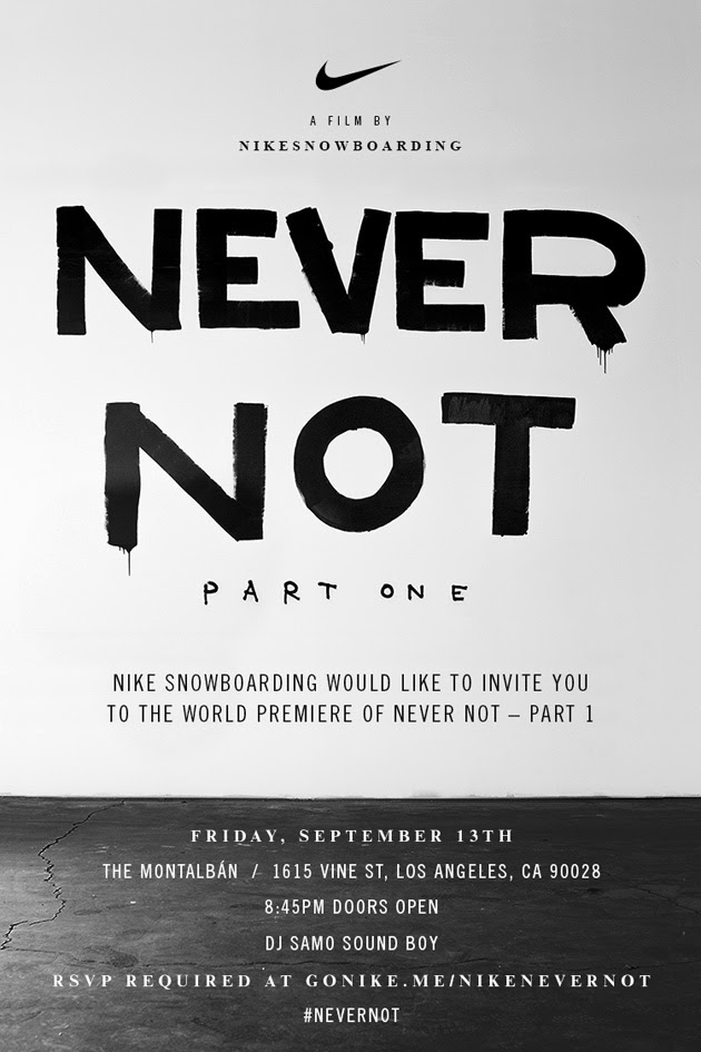
My friend is the featured snowboarder in this ad, and thats part of the reason why I love it so much. I really enjoy their snowboard movement and how they try and get kids involved.

I love the font, absolutely love it. And I also love how its laid out kind of messy and uneven.

This is one of my favorite Nike ads out there. I love the opacity of the lettering and the color splash with the neon green lettering.
I love how they advertise, and this flyer is awesome, so simple, but so awesome.

I thought this was an interesting way to incorporate a brand.

The story behind this is so incredible. After she got hurt in a race Nike released this ad and showed how she was still influencing even if she wasn't running.

This is another simple ad, but I think it has so much power.

This is an old school ad, but it never get old. I love the intensity of it.
__________________________________
Layouts
I focused on all the different possibilities with magazine layouts there are. I love how unique they are and how many different ways you can go with layout design.


I focused on all the different possibilities with magazine layouts there are. I love how unique they are and how many different ways you can go with layout design.

Good use of color.

Really well done typography with the heading.
I absolutely love this layout, with the font and the collage of all the different pieces.

I like the simplicity of this layout, and the color red that was used.

I really like the opacity on top of the image, it really adds a lot to it.

I love how this is almost turned into a piece of art, and I love the color splash with the red.

I think this is exactly what a food layout should look like.

This is an intense layout, and I like that they made the image work without taking anything away from it.

I really like the color scheme of this layout, as well as the layout.

I like the concept behind this one, and the simple black and white layout.

I love how the title carried over on both pages.
No comments:
Post a Comment