2
FONTS
To go alongside the typography section I wanted to add some cool fonts that I came across. Its amazing how bad, and illegible fonts there are out there. So many are too busy and too decorated, but there are also a great number of beautiful and creative fonts that work really well.
FONTS
To go alongside the typography section I wanted to add some cool fonts that I came across. Its amazing how bad, and illegible fonts there are out there. So many are too busy and too decorated, but there are also a great number of beautiful and creative fonts that work really well.
I love this font, mostly because I love geometric designs, and I think this font utilized the concept of geometric design. It is very detailed so I think its confined to only certain things, but I still love the design, I think it is very creative.

I love the idea behind this font, how they used the concept of sign language and made it into a font that even those who don't know sign can understand. I also love how simple it is, with no flashy colors and only black and white.

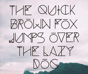
This was one of my favorite fonts I came across, and I thought it was very fun and creative. I love all the bright colors and fun designs. I think this would be a fun font to use in attracting kids and creating decorations. My favorite letter is the O.

This was a font that I found on DaFont. I loved it right away, I love the texture in the fill, and all the twists and curves. I really like calligraphic fonts, but I find that a lot of them are overdone and hard to read. This font however is really artistic, and really easy to read.

Another font from DaFont. I love how the color of the fill alternates, and I also really like how it has that 3D effect on it. I think this is a fun font that could be used in a variety of ways. I wish it had the letters in uppercase as well though.

This is another font from DaFont. I think one of the most interesting types of fonts is graffiti. I don't think I have ever seen a computer generated font that has even come close to being as stunning as real life graffiti, bit I think this is a good basic depiction of that.

Although this isn't the most well done example, I think its an interesting idea. I love how its kind of abstract, but I think that it may be a little too abstract. I love the concept though, and would love to see it done just a little differently.

This is one of my favorite fonts that I have come across when looking through fonts and typography. I love the simplicity of it, and the serifs. I think its really well done and is broad enough and simple enough that it could be used in a variety of ways. Its a really stunning font that I think could supplement an image without overpowering it.

I cam across this in my search and chose to include it as kind of a reminder. There are so many ways you can take type and fonts and this depiction of the alphabet serves as a reminder of that. I like all the different directions the artist took and for the most all the letters are well done.

This is a kind of creepy example of font that I came across. Its titled "Hair" which is really strange. However, as creepy as it is, I also think it is pretty stunning. The contrast on the white background really just boosts the letters. They are hard to read but I really think this font is super creative and well done.
CONCERT POSTERS
One of my favorite types of design is Concert Posters. I absolutely love music and love the visual supplements that come along with it. There are so many ways you can go with concert posters, but you have to be able to accurately depict the style of not only the artist, but the feeling of the event as a whole. I would love to get involved in designing and promoting events like concerts and music festivals.

I chose this poster because A, I love Death Cab for Cutie, and B, I think it accurately depicts their style. They are all about love, and matters of the heart. I love the layout and the color choices. The graphics are really well done and supplement the text really well to make a very visually pleasing final product.

I love the concept behind this poster. I love the color and the way they incorporated the anchor into the design to go along with the rest of it. Its really simple, and there is a lot of open space but I think if there had been any more to it, it would have been too busy.


This is a really abstract example of a concert poster but also one of my favorites. I love the destroyed look, and how its very old fashioned. The graphics fit the band perfectly, and I love how they did the title. My favorite part of this poster is the flower in the middle, it adds just that little bit to top it off perfectly.

I really love the concept behind this poster. Vampires are really common now a days in design and media, and I just love how they went with that, but made it abstract and beautiful. The details are stunning, the progression of the text is a little distracting at first, but I came to love it. I really love this poster and how bold it is.

This is a more simple version of a concert poster, but I really do love it. It fits the Black Keys style really well, and draws you in so you want to know more. I love the bright red and yellow on a plain background and I really like how they have the texture within the flames. The only thing I didn't like about this was the text and the placement of the "the". I think it should have been placed differently so it would be easier to read.

The National always has really stunning posters, but this is by far one of my favorites. It is so beautiful and so simple, yet at the same time its complicated and dark. It is one of the pieces that you find yourself just staring at and wanting to see more. To me, thats what a concert poster should be; unfinished business. I think that a person should view a concert poster and be left with that weird unfulfilled mystery, and want to see what it is all about.

This is a more goofy example of a concert poster, but as goofy as it is, it still fits the personality of The Shins perfectly. I love the placement of the text, and the colors they chose. This is one of those concert posters that makes it seem like its going to be wild, and that should be enough to make people want to go to the concerts.

This poster was interesting to me. I love the concept, but I don't think it was executed that great. I think there could be a few things that if changed would completely change this piece and make it so much better. The bold yellow font was one of the first things I would change, I think it kind of overpowers the other delicate parts of the poster. I also thing the color choice doesn't work together that well, so I would have found different colors to used for her hair and her skin.

I'm still not too sure how I feel about this poster. Artistically I love it, I think its well done, with lots of detail and shading and the colors are awesome. But something about this just doesn't get me excited to attend a concert. It makes me want to go find a secret castle or watch a movie instead. I think its great work, but it didn't quite get that concert emotion out of me.

Bon Iver is notorious for his designs, and this is one of those examples that shows you why. The artistry is flawless, and the colors are stunning. This is one of those posters that although it has no relation to music or any of his songs, it just shows you something beautiful and makes you want to see more beautiful things, and in search of those beautiful things you go to his concerts and hear his unreal voice. That is beauty.

This is one of the more abstract posters I found, but I love it. Its fun, and quirky and childish; which is exactly what Of Monster and Men are all about. The bright colors, and bold lines outline it perfectly and make it very visually pleasing. I also really love the font I thought it worked well. If you stare at it long enough you see exactly what they made, a monster and a typical working man. Brilliant.

It was hard for me not to include every single Bon Iver poster, because they are all so beautiful to me. I love the concept behind this poster, and I think it was really well executed. I would have played with the fonts a little bit to make sure they all flowed together better. All in all, I adore this poster, and think it is really well done.

This poster is the epitome of music festivals in my eyes. When you think of music festivals you think of hipsters and big old VW vans, this poster captures that essence flawlessly. The colors all work together really well, and it has mostly all of the information you could need. I love this poster and it makes me want to become a hippie and drive around the country attending every single festival possible. Not sure if that is a good thing, or a bad thing.

This was another one of my favorite posters. It has this childish, uneven and messy vibe about it, but i think it just works. There are so many different patterns and textures going on, that normally would be too overwhelming. However, I think the neutral color choices and layout made it all work. I love how the text box was added, and how it doesn't just seem like a big yellow box, but like it twirls in with the ocean. One other thing I really liked about this piece was how they included the price of the concert. The price is usually one of the first things I think about and it usually isn't included on the posters.

This is a very, very busy concert poster, but somehow it works. Usually, similar things hurt my eyeballs, but something about this poster is calming and just brings a smile to my face. There is so much going on; so many colors and so many different styles of design. The type is funky and bold, and the woman's face looks like she is really just out of her mind, but it really comes together to make this funky well-done concert poster.

This is the perfect example of a music festival poster. I love how they took the title and made it welcoming. I mean, who wants to go to a music festival centered around "Sasquatch", when you think of Sasquatch you think of big, scary and violent. So I think the designer did a really good job of taking a difficult topic and making it friendly, relaxed an inviting. The colors are really pleasing to the eye, its informative, and the details are great.

This was one of my very favorite examples of concert posters that I was able to find. The colors are perfect, the design is stunning, and the concept behind it is brilliant. It all ties together perfectly and draws you in immediately. I would want to go to this music festival just because of this poster.
No comments:
Post a Comment