Thursday, December 12, 2013

Week 12

12

Branding 

As we looked into the branding assignments, I decided to follow one of the most influential and well branded companies to date. Nike has had powerful advertising and designs for so many years, and it was easy to see how well branded it was and how that branding has attributed to their success. 


I love how this is more of an abstract style with the font, and how the colors add dimension and really make it that much more interesting to look at. 


This style of nike ad isn't my personal favorite but I think its so creative and the design would appeal to many that would view it. 


The thing I love about Nike is that they keep it real, and make bold statements. This Marilyn Monroe piece was one of my favorites and I think one of the strongest campaigns that Nike has put forth. 


This is another strong campaign from Nike, one that many found inappropriate. I loved it though, I think it shows everyones potential and addresses and issue that plagues so many. 


I love how they put bold statements on their advertisements, I think that it really helps add to the intensity of their advertisements. 


I love the black and white with the color splash in the nike symbol. 


I really love how much emotion this one has. I think it shows how an athlete thinks, and I think the design of the tattoo on his face really adds a lot as well. 


My friend is the featured snowboarder in this ad, and thats part of the reason why I love it so much. I really enjoy their snowboard movement and how they try and get kids involved. 


I love the font, absolutely love it. And I also love how its laid out kind of messy and uneven. 


This is one of my favorite Nike ads out there. I love the opacity of the lettering and the color splash with the neon green lettering. 
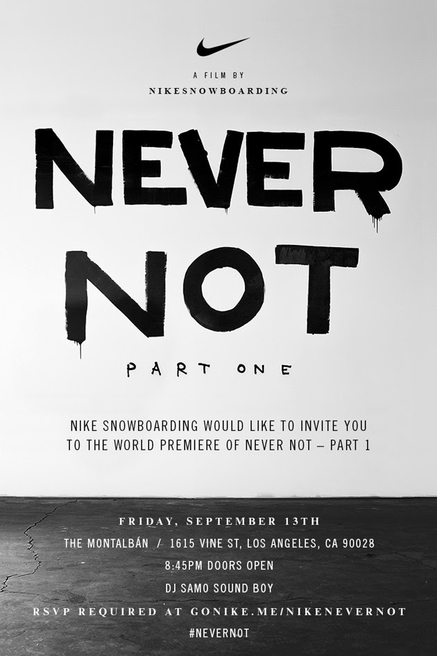

I love how they advertise, and this flyer is awesome, so simple, but so awesome. 


I thought this was an interesting way to incorporate a brand. 


The story behind this is so incredible. After she got hurt in a race Nike released this ad and showed how she was still influencing even if she wasn't running. 


This is another simple ad, but I think it has so much power. 


This is an old school ad, but it never get old. I love the intensity of it. 

__________________________________

Layouts
I focused on all the different possibilities with magazine layouts there are. I love how unique they are and how many different ways you can go with layout design. 


Good use of color. 


Really well done typography with the heading. 


I absolutely love this layout, with the font and the collage of all the different pieces. 


I like the simplicity of this layout, and the color red that was used. 


I really like the opacity on top of the image, it really adds a lot to it. 


I love how this is almost turned into a piece of art, and I love the color splash with the red. 


I think this is exactly what a food layout should look like. 


This is an intense layout, and I like that they made the image work without taking anything away from it. 


I really like the color scheme of this layout, as well as the layout. 


I like the concept behind this one, and the simple black and white layout. 


I love how the title carried over on both pages. 


Week 11

11

2 Color Posters

Trying to find some examples for the big text poster assignment we have coming up. Sadly there is not many examples of that, and this was the closest I could really find. 


I loved the distortion with this poster. How some of the words are upside down, but not all of them. I also love the color choice with the turquoise and white on a black and white photo in the background. 


I just thought this was a really creative idea, with how they made it drip ink and then there is the & drop in the ink drop. I also love the texture of the background, as if it were roughly painted on it. It adds a lot of dimension and texture to the piece. 


I really love this poster, its so creative. I love the umbrella and the rough text all around it. I also love how how they had rain drops coming from the sky, and the bold lettering that helps direct your attention into the right places. 


This is interesting to me, I hate it but at the same time I don't. Its too chaotic, but at the same time its really fun to look at it. Its informative, and colorful while not being too colorful. I really just cant make up my mind on how I feel about it. 


I love this piece, it makes so much since. I love how it is combining the two heads, showing how so someone is lost in their own mind, confused on which side to take; the good or the bad. I love the details alternating in colors at the bottom and the bold title. 


I love the divide in this piece. I love how they flipped it back and forth, and the simplicity yet complexity of it all. I really like the color scheme as well, it makes it really easy to look at. 


I love this one because of the bear, I like how the background doesn't make it seem as scary, and its actually kind of inviting. I love the details behind the bear as well that kind of help add dimension to the piece. 


I think this is a unique example, and I love the color scheme. I really like the details within the men, and the font and the banners. I love how they are turned facing the same direction it helps guide your attention.


This is one of my favorite pieces, I love the bold colors, vivid details and the marbled background. I think it brings forth a sense of mystery which makes you want to know more. I love the details in the triangle it makes it easy to look at. 

I really love the color and the bold fonts. The large fonts overlap and at first may seem chaotic, but at the same time it also comes across as kind of peaceful. I would definitely want to attend this concert. I also love the texture in the polka dots at the top of the piece. 


I really love this holiday themed piece, I love all the fun details in the bow and the titles. I think if I saw it in a window or on a telephone pole I would definitely want to go to the event. I think its a good use of color and texture. 
_________________________________

Olympics

In honor of the olympic games coming up next month I wanted to look at some of the old olympic visuals that have helped change the way they promote over the years. 


Like they say, everything gets better with age, I think that this promo poster is fantastic. I love the creme background, and the details in the skyline. I also love the font, and how big the olympic rings are above the rest of the poster. I really like how they took an older approach to it. 


I thought this was an amazing piece, representing how a nation will lift up their athletes during the olympics. I think this is a really powerful image that is well edited and has a lot of meaning behind it. It really brings light to how much the Olympics mean to all 


I think that last summers Olympic logo and kind of energy was very unique. I love how modern and bright it was, but at the same time I love the old school patriotic Olympics graphics and advertisements that they do. 


I love looking at this poster, because that really was one of the most memorable moments in Olympic history. I love how they incorporated the flags and how they placed the font as well as the supplement text underneath it. I also love the textured background with the scratched up ice. 


I love this older example from the olympics. I love the messy font that seems uneven and random, and the details in the buildings. I love the blue background and the way the Olympic rings are placed on the poster. 


This logo makes me excited for the Rio Olympics because it brings this sense of unity in my opinion, I love how they sculpted the trio of people and how they flow together perfectly. I really love this logo and look forward to the olympics. 


I am so excited for the Sochi olympics, not only to watch my friends compete but because it means another year of seeing unique advertisements and campaigns. I think they are already off to a great start for the Sochi games. 

Vancouver was one of the years that I remember watching the most. I love the flow of their advertisements and the colors used. I love how it was designed and how free flowing it is. I love the details intertwined, with the trees and the critters in the back. 


This logo is so familiar to me, because it is stamped all around Salt Lake City many close to my home. I work on the mountain they compete on, so its really interesting to look at at think of all it represents. I love the snowflake and how they put different colors in it. I will always love this logo. 

Week 10

10

The Color Orange 

for our color projects I picked the tricky color orange. There isn't a ton about it, but its interesting to learn about one of the most under-appreciated colors in the color wheel.  


This represents orange in the sense of peace and tranquility. The book follows a young man who sets forth to live a peaceful life. 


This is orange representing change, the change in seasons from summer to fall. 


Orange representing an often rejected idea, and how people tend to lose sight of what is really important to them, and that is their family. 


This is orange representing moving forward, orange offers strength in hard times. 


This was the perfect color to use for this because orange helps us bounce back in difficult times. Which really represents what they were trying to promote through this poster. 


I really love this as an ad for a company, because through the different colors of orange it comes across as very cheerful and exciting. 

I just love this piece, and the contrast within it. I really like how it continues off the perceived canvas. I also really like all the different fonts within it. 


I think this example shows how orange can be optimistic and cheerful.I think its just a really bright and happy and I enjoy looking at it.  


I thought this was a cool logo, a very clean and fresh logo. I love the different shades of orange, but I think the butterfly is a little too much and a little tacky. 


This one speaks for itself. It really gets that happy and uplifting emotion brewing. I also love how it has two different fonts in it that complement each other well. 


Orange represents social interaction, so I think in this case it shows orange in the sense of someone trying to fit into a social scene. 


This one does really portray meaning, but I think it is a cool way to use all the different shades of orange. 

_________________________________________________________________________________


Lacrosse Advertisements

I play lacrosse here at Lindenwood, so its always interesting to see all the advertisements that come out around the country.Since lacrosse is relatively new, some of the media and advertisements aren't that great, and lack professional touch. It is really weird to watch the lacrosse world evolve and adapt to a more broad and commercial style. 


I love the layout and the bold font. I think they were smart in having the two different colors of text. Overall I think its a bold statement, and a really creative concept.  I think the fact that they put the text in the back at first and then in the front really adds to it and makes it  


This is one of my favorite lacrosse ads, I love it as a whole, as well as many of its individual features. I really love the font, and the silhouettes of the players against the rain. I also really like the message it is portraying in stating that lacrosse isn't about appearance but what you do when you step on the field. 


This is the logo from a lacrosse store in my hometown. They use it on stickers for cars and windows, and it has spread like wildfire in Utah. I think the colors they used draw immediate attention, and I really love their unique and original. The font kind of throws me off if I stare it for too long, but overall this is one of my favorite logos. 


This is another lacrosse logo that I think is really well done. I love the simplicity with the just the black and white, as well as the tag line and bold font. I think they did a really good job with the logo design, and I think it really makes it seem prestigious and people would want to use their gear. 

This was a logo for a lacrosse tournament that I personally played in. I think the logo represents the location and the sport really well. I love the banner and the different fonts. I also love how they tied in the details with the mountains and the lacrosse head. 


I love Nike ads, and i really love this one because it has such a cool picture and such a powerful quote behind it. I think they did a really good job with the bold lettering and the placement of everything. 


I think this is a cool ad because its in the winter, which just really makes it that much more dramatic. I love the wording in front of the player, and since its placed in front of the player it takes the spotlight off of him and more on the message it is trying to send. 


I think that US Lacrosse did a good job with their logo. They made it patriotic and legible. I really like how they incorporated the shape of the lacrosse head and the detail with the ball and the movement of the ball. 

This is our schools lacrosse logo, I personally love it. I love how they used all the school colors and the school mascot. I think there is always room for improvement, but as far as a simple logo its very solid and easy to look at. 


I thought this was a cool concept, a little tacky and I feel like they could have used more of the empty space to make a better piece and advertise themselves much better. 
A couple years ago a UVA lacrosse player who was number 1 on the team and was murdered by her boyfriend, and the whole lacrosse community came together to not let something so terrible happen to female college students again. I love the logo, and I think it is really moving to look at. The heart immediately grasps your attention and then you see the 1 above it and you then realize what it represents.